Overview
@everscribe/components is the embeddable audit-trail UI you can drop into your customer-facing app or admin portal.
Source: github.com/everscribe/components
Pick a package
| Frontend | Page | Package |
|---|---|---|
| React | React | @everscribe/components-react |
| Svelte | Svelte | @everscribe/components-element |
| Plain HTML / Vue / Solid / Angular | Vanilla JS | @everscribe/components-element |
| Building your own UI | Core | @everscribe/components-core |
| Theming | Styles | @everscribe/components-styles |
Svelte and Vanilla JS both consume the same @everscribe/components-element package. <audit-trail> is a single custom element that works in every framework.
React gets its own package because React 18's custom-element interop has rough edges around prop conventions and synthetic events.
What they look like
This screenshot is from the single-tenant React + Go full-stack example, using the default theme.
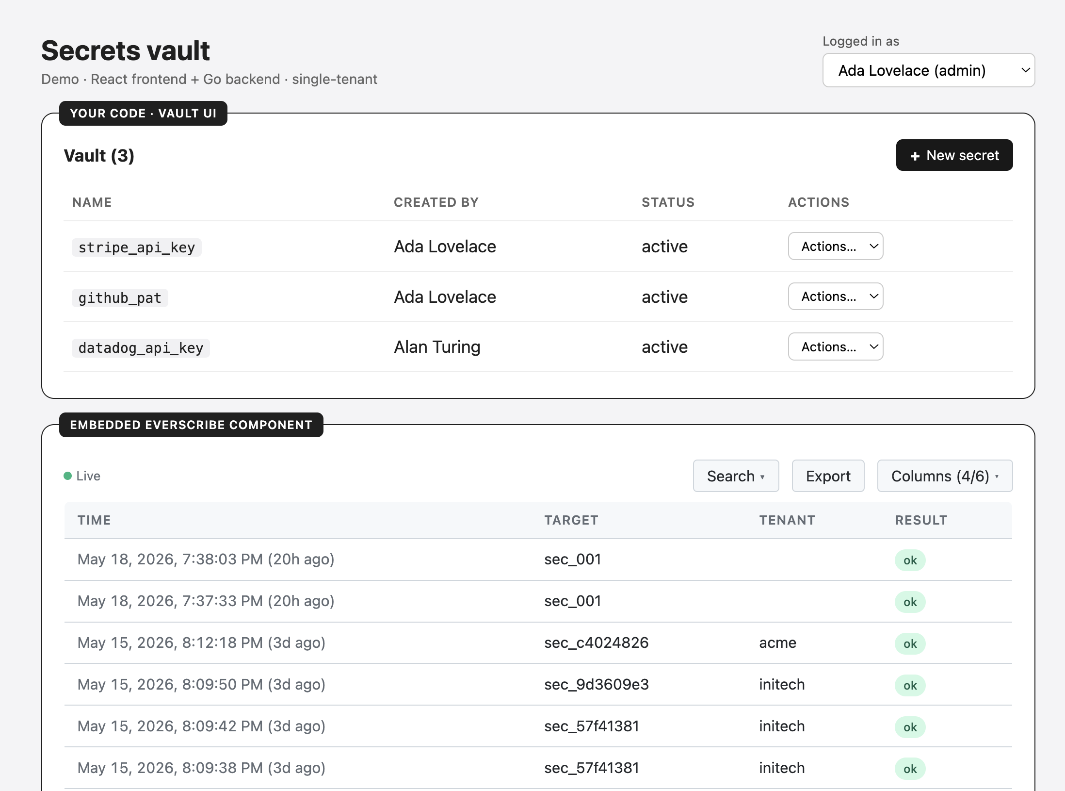
Every visual property — colors, spacing, typography, borders, radii — is a CSS variable supplied by @everscribe/components-styles, so you can re-skin the embed to match your brand without forking the component.
What next
- Prerequisites — Token minting
- React —
<AuditTrail />for React apps - Svelte —
<audit-trail>patterns in Svelte - Vanilla JS —
<audit-trail>in plain HTML (and Vue / Solid / Angular) - Core — the data layer if you're building your own UI
- Styles — theming via CSS variables